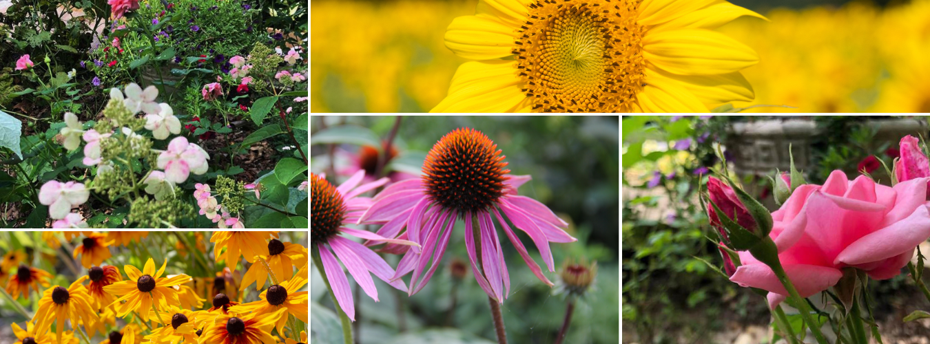
Several times I have said that gardens need to have focal points. I taught art in schools for many years, and over and over again, I would ask a student about what he had created: “Where is your Beauty Spot?” I could have also said “Where is most of the Magic happening in your piece?” That magical area is usually the Center of Attention or the Focal Point. Establishing a Beauty Spot or a spot that clearly stands out is important in any type of art. In almost every case, that magical focal point is where your design has created Emphasis, and Emphasis is a fundamental principle of all types of design, including garden design. Following, I’ll share some views of my garden where I have created definite focal points: To help clarify my point, I’ll also show you some of my garden spots that have no focal points.

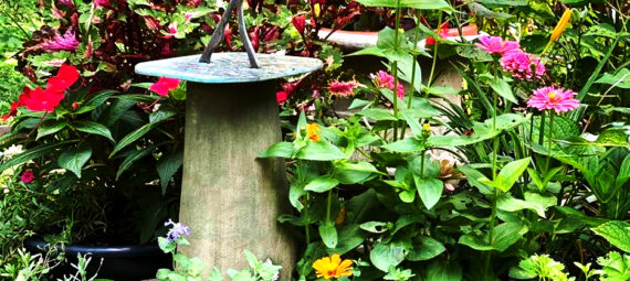
Sundial – Jacki Kellum Garden – July 23, 2021
In the above photo, the sundial, because of the ways that it contrasts and thereby stands out from the vegetation, is the focal point or the center of attention or the beauty spot of that place in my garden.
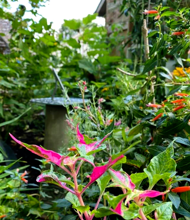
Sundial – Jacki Kellum Garden – August 21, 2021
In the above photo, my garden had grown and had nearly smothered the sundial, but here is the secret: I had NOT allowed the vegetation to smother the sundial entirely. The grays, and the shiny metals are still a contrast to all the lush vegetation around it and thereby, the sundial [although it is smaller than the rest of the photo, which is all vegetation]. is still the center of attention.

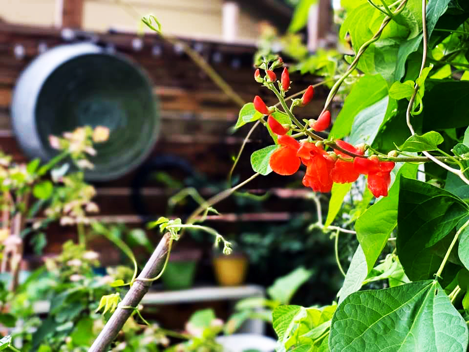
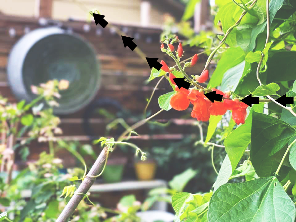
Scarlet Runner Beans and Vine – Jacki Kellum Garden –
July 29, 2021
Although the washtub and the wooden wall above are unlike the obelisk filled with vines, neither of those areas could be said to have a Magic Spot or a Center of Attention. The obelisk is nice, but so is the washtub. The two elements cancel each other out. There is no focal point in the above photo, and thereby, there is no emphasis.
I used to tell my students that when their pieces had no focal points that they simply looked like pizza. In such cases, if they had created a construction paper piece, they would have scattered all the bits of paper evenly on their papers without making anything the star piece. The garden space in the photo above is like pizza. Nothing is the star.
Emphasis Is A Principle of Design
Following is an outstanding video which contrasts lack of emphasis with emphasis. As the video begins, you will be able to distinguish the pizza-like dance from that which is clearly not pizza.
All design [even garden design] needs to allow some areas to stand out more than others. Too much of the same kills most art [including gardens]. We need variety, contrast, and focal points in everything that we design.
Scarlet Runner Beans and Vine – Jacki Kellum Garden –
August 22, 2021
It is obvious that the red blossoms are the center of attention and/or the focal point in the above photo of my Scarlet Runner Beans. The vine also does something else for the above composition. It creates visual movement.. As the eye moves from the right toward the left, it travels along the vine, up and above the washtub to left of the mid-back of the garden wall.
Movement Is A Principle of Design
Lines of Movement can create a problem, however. Unless some other element is there to stop the line of movement and to re-direct it, the eye will travel completely out of the visual area.

In the above photo, you see that the washtub serves as a weighty element that prevents the eye from moving off the page. The washtub anchors the scene and brings the eye back down and into the visual area again.
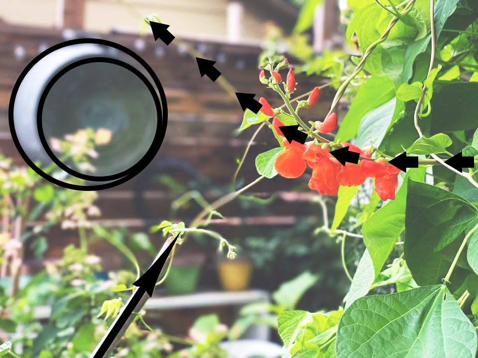
Once the eye is brought back downward, it finds the bamboo bean pole on the lower right, and that pole points back toward the red blossom again. The bamboo-back-to-the-red-blossoms is another line of movement, and everywhere that the vine snakes around, there are less important lines of movement, too. But the most important line of movement begins along the vine to the right of where the red blossoms are. Because that area is the focal point, that is where your eye returns again and again. Movement becomes a circulating type of thing, It takes you all around your visual area and back to your focal point, over and over again..
Granted, I did not plan for the Scarlet Runner Beans to vine in just the waya that they did in the above photo. Some of this blog post is more about how to photograph your garden than how to design it. But one of my best tips of all time is to always be on the lookout for magic in your garden and to make the most of the magic that you see happening in your yard.

But I knew from past experience that the arching vines of the Scarlet Runner Beans would bring magical spots to several parts of my garden.
With the catch-the-magic-that-happens advice, I must say that when I plant anything, I have a pretty good idea of how that plant will behave and basically what my results will be. To say that my garden is a series of accidents would not be correct. For instance, when I planted the grasses in the photo below, I had a very real idea of what I’d eventually grow in that spot.

Autumnal Grasses in Jacki Kellum Garden
August 24, 2021
In the above photo, both the Purple Fountain Grass and the Green Lemongrass almost meet in an arch and they thereby visually connect. In that way, The grasses together are the focal point. The birdhouse and the arbor are taller than the grasses, but the arching and spiking energy or the movement of the grasses, becomes that area’s center of attention.

In the above photo, a variety of sizes, colors, and shapes is represented, but there is no real center of attention. The above photo is another pizza pie.

In the above photo, however, there are some areas that contrast a great deal and thereby compete to be the center of attention. We might be tempted to say that the big bright pink flowers on the right are the focal point, but I believe that the true center of attention in the above image is the raised pedestal in front of which the short, pink arctic fox foxglove is growing. The contrast of the textures and the color of that pedestal are undeniably unique to the rest of the elements of the above scene. Like the vine in the Scarlet Runner Bean photo, the series of bight pink blooms lead the eye from right toward and to the pedestal. The dark purple behind the final pink blossom and behind the pedestal provide contrast, and contrast is another principle of good design

In the above photo, the big pink blossom is the definite center of attention, and that focal point is intensified by the contrast of the dark plantings behind it.
Contrast Is A Principal of Design.

I love the darker tones of bright pink, but honestly, the above big pink dot alone will not be able to hold my interest for long. In fact, on some days, I might not notice it at all.

By adding the darker color behind the same pink circle, we have added contrast and we have made the pink dot stand out more, and yet, while the addition of contrasting dark adds more interest to the composition above, something more is needed to create adequate interest to sustain a viewer for any period of time.
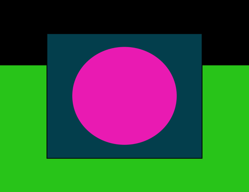
Adding a few other areas of color creates a bit more interest, but color is not a principle of design. It is an element of art. While the principles of design are more about what it takes for a design to be well-composed, to be balanced, and about what is necessary for the viewer’s eye to move freely around the visual space, the elements of art are what comprise the piece itself.
Color Is An Element of Art.
But let’s take this discussion a bit further: The above design has not only added color to the mix. It is also well-balanced.
Balance Is A Principle of Design.
To be specific, the above design is symmetrically balanced. Symmetrical balance means that everything on the right is the same as that on the left. Formal gardens often employ symmetrical design in the landscape.

But I am a cottage garden gardener, and
Cottage gardens are never formal in design.

In the book The Cottage Garden, Lloyd said the following
“By the 1800’s, the informal style of Cottage Gardens had become more popular and they were more widespread.”
Better Homes and Gardens says that informality is a trademark of cottage gardens.
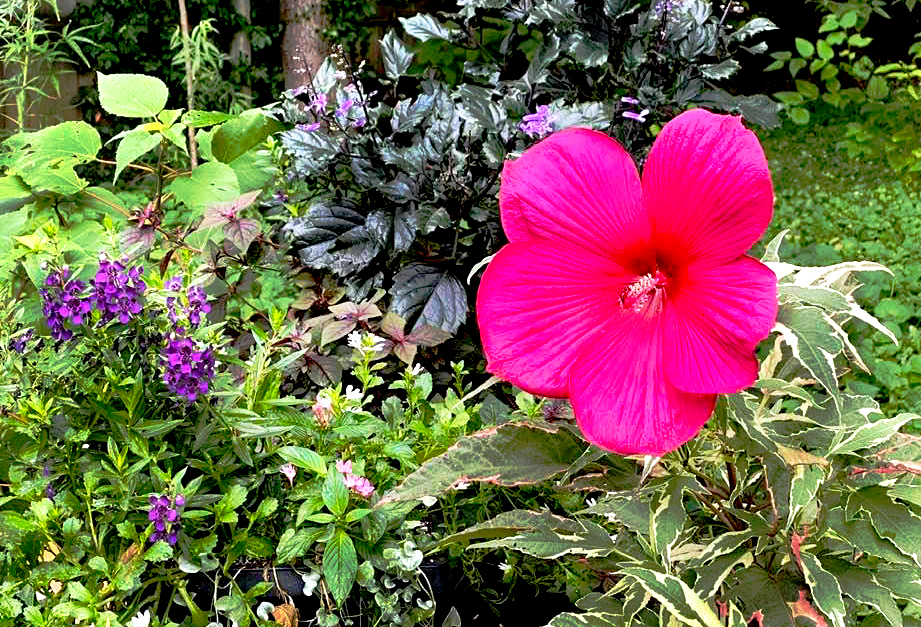
The above view of my pink Summer Carnival hibiscus is a good example of asymmetrical design, which is usually less formal than symmetrical design. In the above photo, the large pink blossom is NOT in the center of the above scene and everything else is not equally and identically distributed around that center. Rather, the pink blossom is off to the right, and other supporting elements are scattered about, Notice that they other plants are not scattered about in any formal, predictable way, and yet, the composition in the above photo is still balanced. Not only is it balanced, the above view of my garden is interesting and pleasing to the eye. Much of that interest is achieved by the variety of colors, shapes, and sizes of plants that comprise the above scene.
Variety Is A Principle of Design
In the above design, the big pink is still the focal point. The darker colors behind the pink create contrast against and make the bright pink stand out. To make the design less formal, the big pink circle is moved off center and to the right. Thus, the above design is an example of asymmetrical design. and the additional colors and shapes bring variety to the design. The repetition of several shapes and colors creates movement in the above design. Your eye will skip from one repeated color to the other, and that is how movement is achieved. The ways that the smaller elements are placed assure that the design is balanced. But in asymmetrical design, balance is something that you feel or sense more than something that you can prove in any scientific way.
Balance Is A Principle of Design.
Variety Is A Principle of Design.
Repetition Is A Principle of Design.

In the above photo, the foliage of Summer Carnival is the center of attention. The tips of the foliage point radially to very direction of the frame, and In doing so, the leaf tips establish the primary movement. The repetition of the small daisy-like flowers establish movement on the right side of the frame.
The above composition has asymmetrical design.

In the above photo , the light pink rose is the center of attention, and the darker urn of purple flowers provides the contrast necessary for the pink rose to truly stand out. The above composition is also an example of asymmetrical design.

The above photo was taken in August, months after the one before it was taken. The foliage in the above photo had camouflaged the urn, but the darkness of the foliage still provides enough contrast to allow the pink rose to sing.

The above photo of my bottle fountain is another good example of several principles of design working together. Although there are several striking areas in the above photo, the bottle fountain is the center of attention, and the smaller dabs of color move the viewer’s eye in and out of the center of attention.
My fountain shows that I often allow a non-flowering, non-living thing to become a focal point in my garden. In other photos, you have seen my sundial, my obelisk, and my arbor, all of which are not plants and yet, they serve as centers of attention in my garden. Here is one final important tip: You can have several of these artificial focal points spread throughout your gardenscape, but you must separate them so that in looking out over your vista, you only see one of them at a time.
Focal points in a garden should never be forced to compete for attention.
Composition and garden are probably more natural for me than they are for some, and that should be the case. When I am not gardening, I am a painter, and I have been creating art and design almost my entire life. My dad was a cartoonist, and I grew up copying from his textbooks. I have an MA in painting, and after having taught art for years, I still paint when I am not gardening.
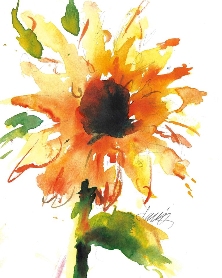
Sunflower – Jacki Kellum Watercolor Painting
In the above painting, you will notice that the petals are creating movement radially toward every area of the canvas. The design is much the same as the movement that you see in the foliage of my Summer Carnival, which is several photos prior to this one.
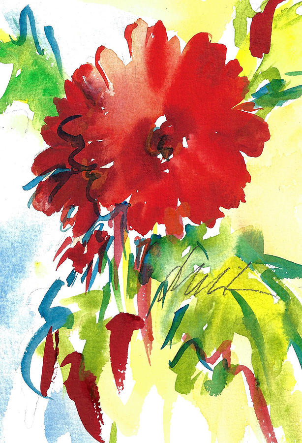
Gerberas Red, White, and Blue – Jacki Kellum Watercolor
The above painting of gerberas has that same kind of radiating movement. The above painting has a lot of energy.

Janis Joplin – Jacki Kellum Watercolor – Sold
That same movement and energy are also part of the success of my painting of Janis Joplin. Anyone who knows anything about Janis Joplin will no doubt agree that when she was performing, Janis Joplin was unbridled energy. I needed that energy to capture Janis’s spirit.
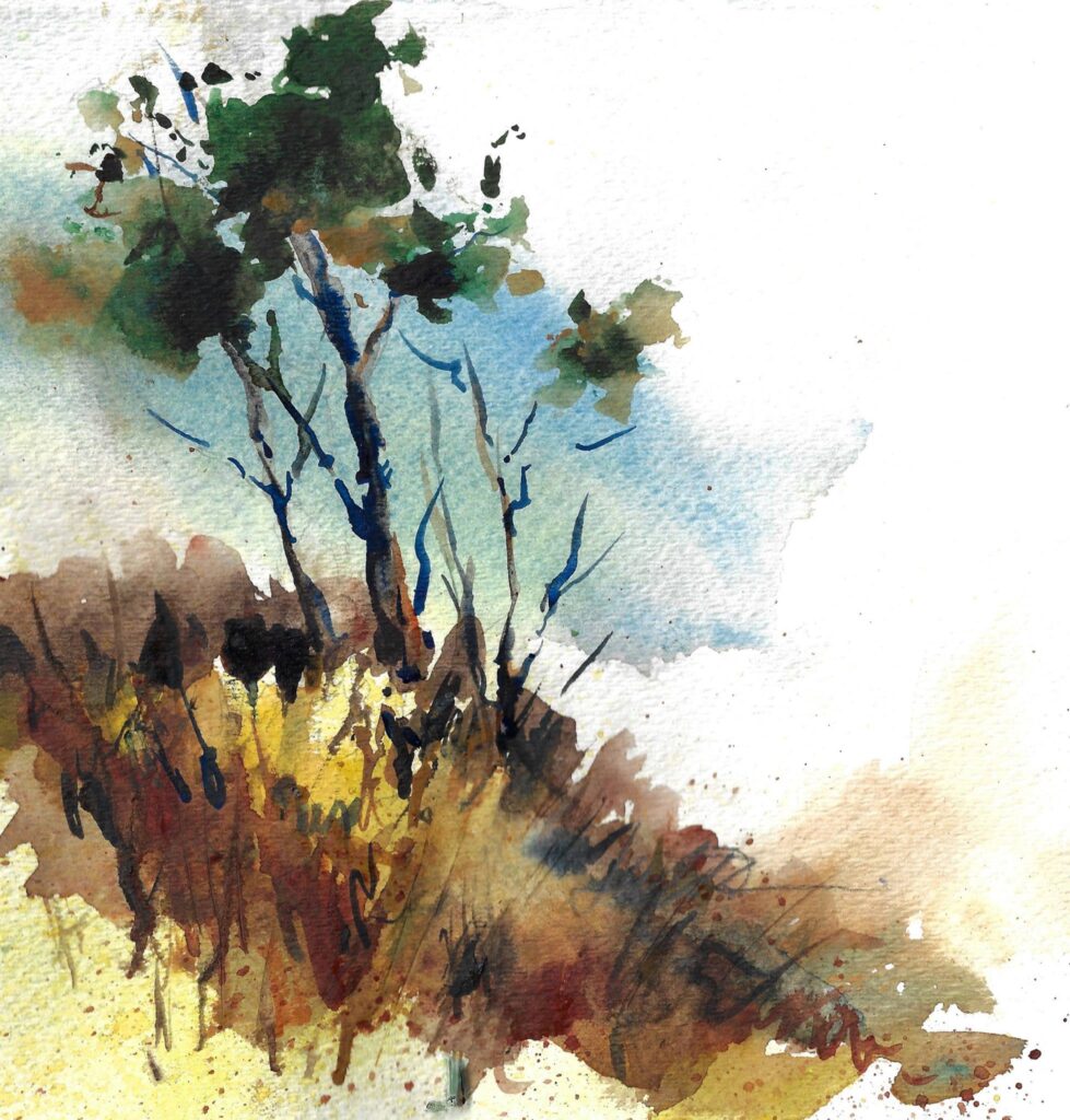
Sapling’s First September – Jacki Kellum Watercolor
If it weren’t for the splash of blue sky to contrast it, the sapling in the above painting would have not worked. Notice how the drips, splashes, branches, and weeds create movement throughout the frame. An example of asymmetrical design, the large white area on the upper right helps balance all the action on the other side.
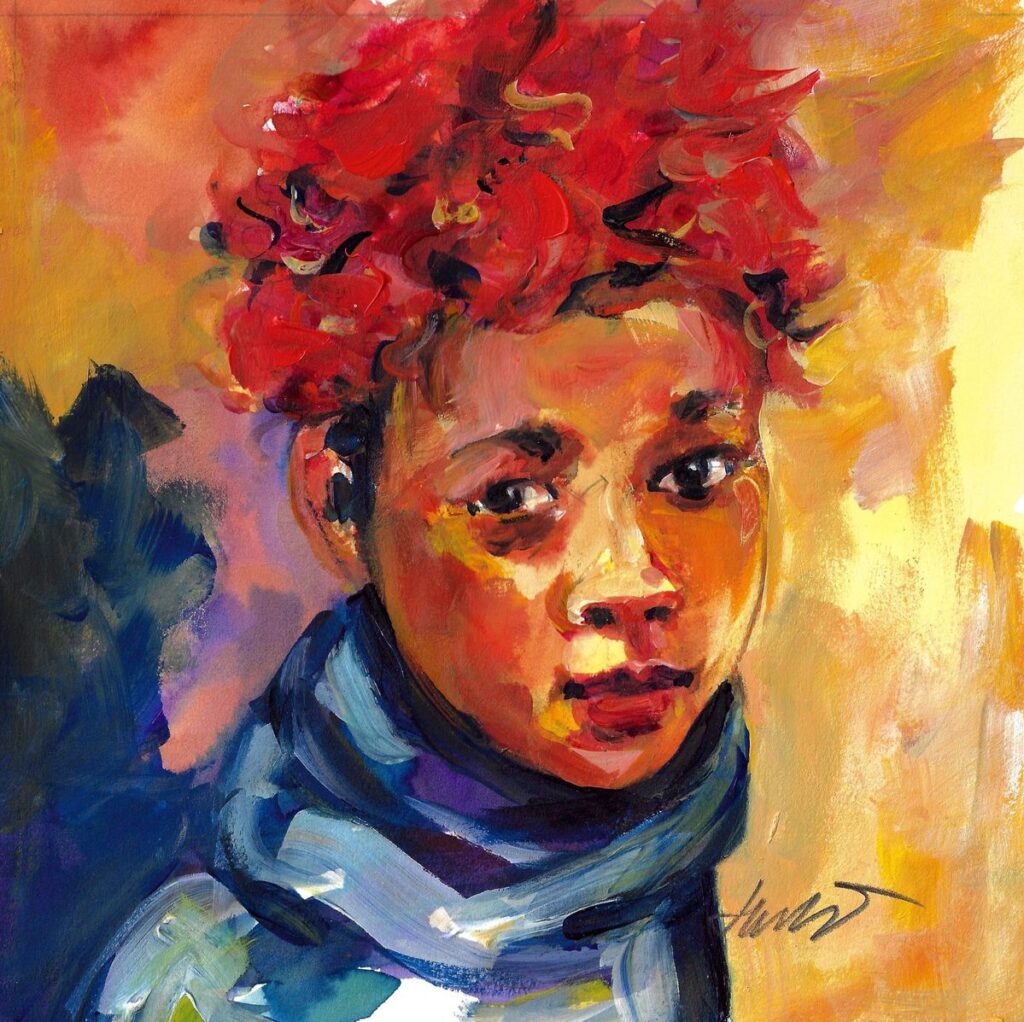
Blue Neck Scarf – Jacki Kellum Acrylic
The contrast of the lighter background to the darker foreground helps make Blue Neck Scarf work The lines of the neck scarf create movement around and help accentuate the focal point, which is the boy’s head.